JSC270, Winter 2020 - Prof. Chevalier
Laboratory 6.0 - Communication 
Pre-lab assignment 
Due date: February 12, 2020 at 12:00pm (noon) 
Objectives
- Decode visualization designs.
- Critically judge visualization designs with respect to deception and perception flaws.
- Create an informed re-design of a visualization.
Instructions
- Make a copy of this notebook using the Github Classroom link: https://classroom.github.com/a/91YH1pFo.
- Answer the questions in the cells that indicate where your answers should be placed.
- Make sure that you explain your solutions when asked and comment your code for readability.
- Commit and push changes to the Github classroom repository that has been provided (more details below).
- Submit a pdf report to Quercus (more details below).
I. Decode visualization designs
You have learned in class that a visualization uses marks to represent data elements, whose visual properties (aka visual channels, visual variables, retinal variables) are mapped to data characteristics.
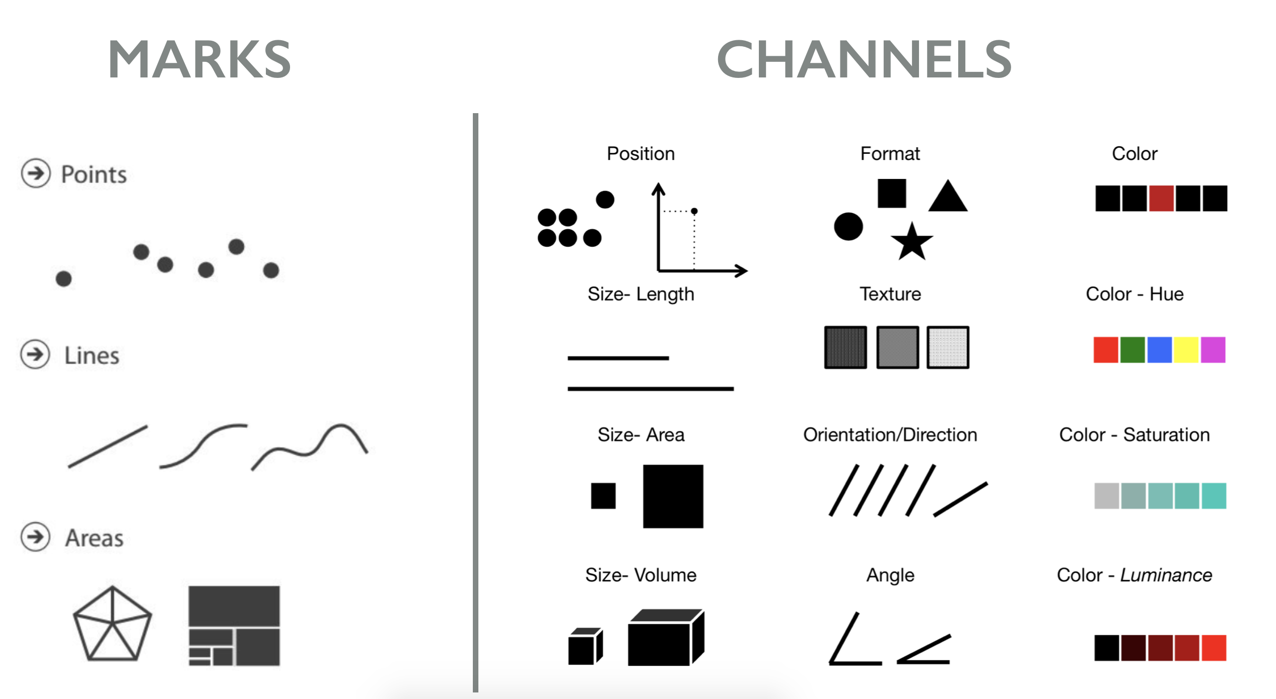
In this exercise, you will decompose and decode the visualization by listing the mark(s) used and the visual channel(s) used to encode data characterists as follows:
Marks used?
- Mark of type ... encodes ...
Visual channels used?
- Channel ... encodes ...
- Channel ... encodes ...
An example is provided below.
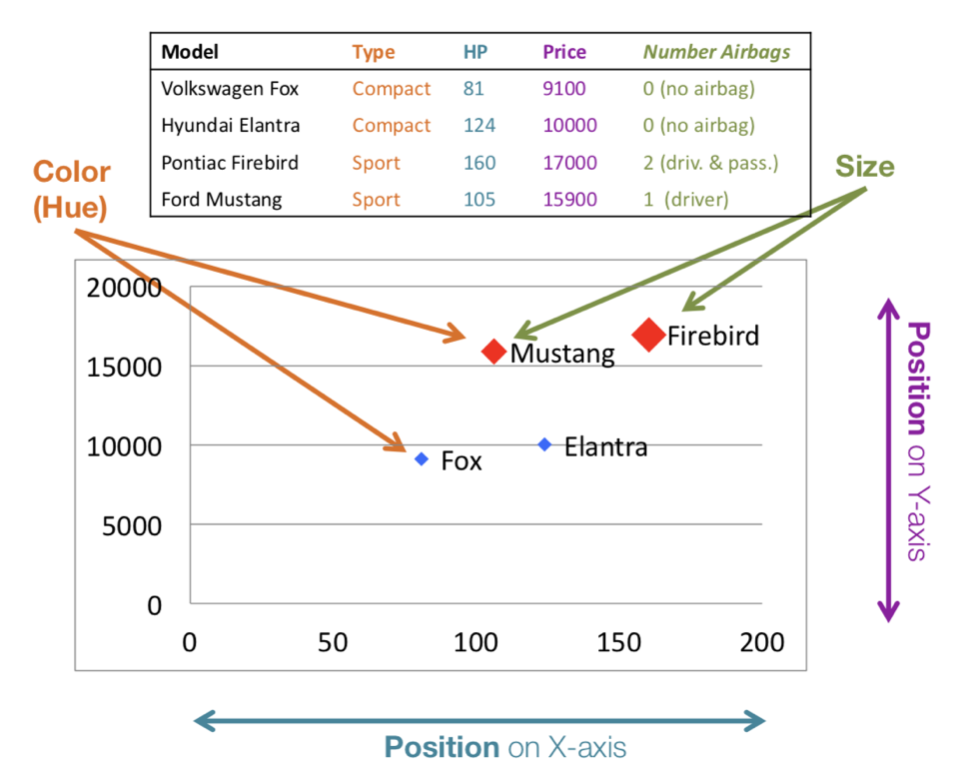
Marks used?
- Mark of type points encodes cars
Visual channels used?
- Channel x-position encodes horse power
- Channel y-position encodes price
- Channel hue encodes car type
- Channel size encodes number of airbags
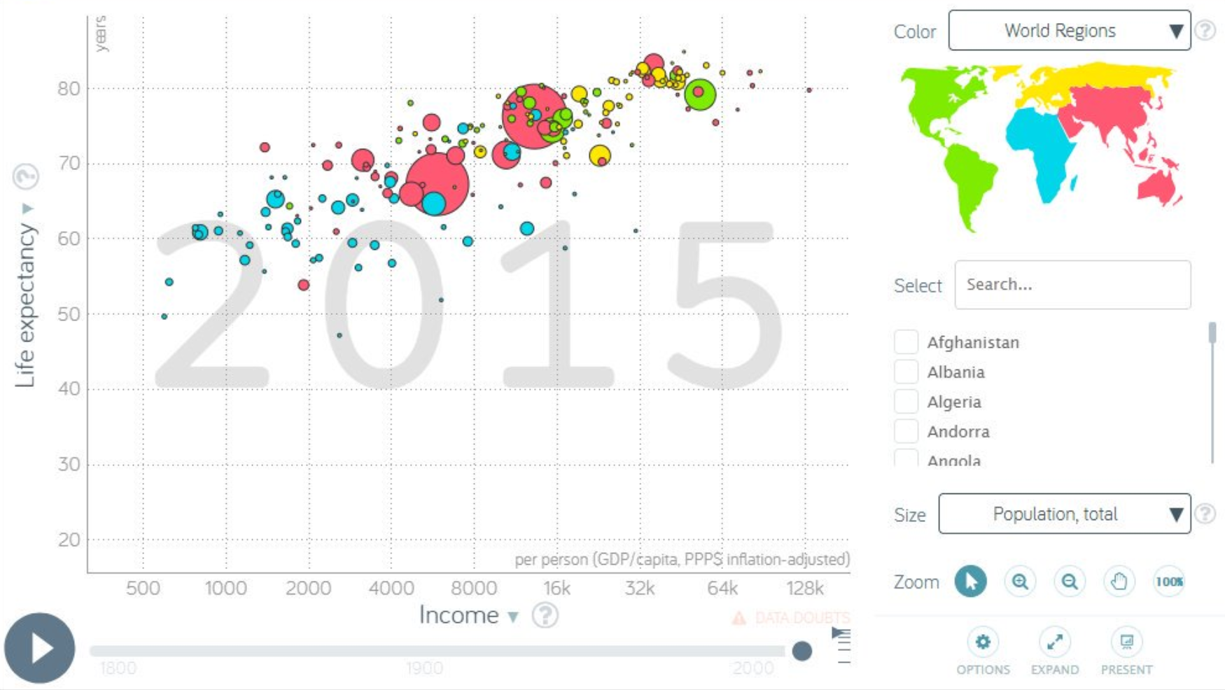
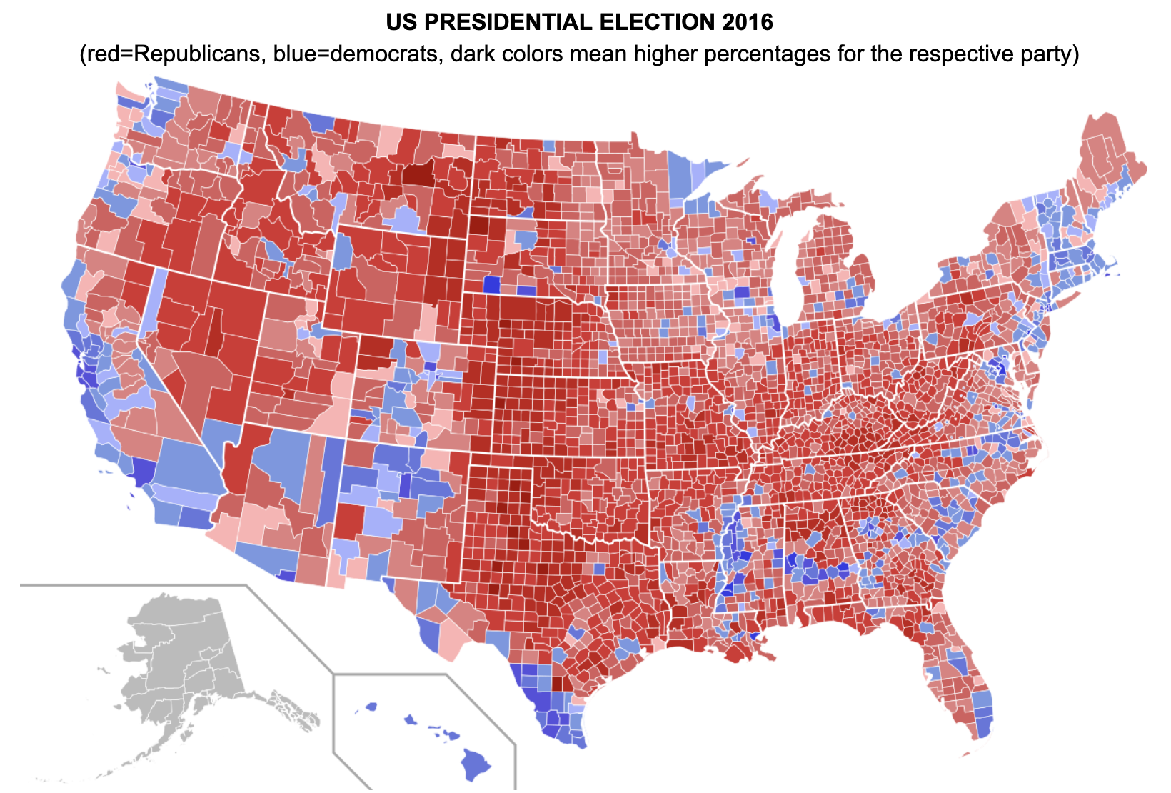
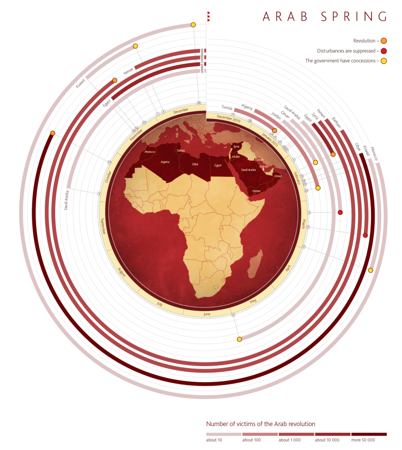
Question 1: Decompose each of the visualization designs below, by providing a list of the mark(s) used and the visual channel(s) used.
II. Critically judge visualization designs
Question 2: For each of the visualizations above, list as many flaws in the visualization design as possible.
III. Create an informed (re-)design of a visualization
Question 3: For each of the visualizations above, propose a possible solution to make the visualization design better for the general population. Hint: define one key message to be communicated with the visualization, and design your visualization to best communicate this message. You can describe the changes using text, but we encourage you to sketch the proposed solution on paper, or using a drawing tool of your choice (powerpoint, illustrator, ...) and include images of your solutions. Explain the rationale behind your design choices.
Submission and Grading
¶Submission
- Commit your work to the Github repository
- include your ipynb file
- don't forget to add image files, if you include images
- save this notebook as an html document and commit to your repository
- Create a pdf of your notebook including the code cells (print this notebook to pdf), and upload the pdf to Quercus.
Grading
The following grading scheme will be used for this assignment.
Note that marks will be deduced for the following reasons: notebook doesn't compile; files are missing; instructions are not followed.
| Marks | ||
|---|---|---|
| Question 1 | Answer is thoughtful, thorough and clear. 0.5pt per visualization. |
2.5 |
| Question 2 | Answer is thoughtful, thorough and clear. 1pt per visualization. |
5 |
| Question 3 | Answer is thoughtful, thorough and clear. 1.5pt per visualization. |
7.5 |
| Total | 15 |
